Reflection

Going Back
With everyone you do, there is always that “If I could go back…”, and I’m sure that happens with most people learning web design. I know for myself, I would review my notes more often, and not just when I was using them while doing an exercise or project. With that being said, I may want to be more organized with my note taking, and pay attention more closely. It seemed I always was missing something from my notes. Before entering the class, I wish I knew how much Photoshop would be involved, and how it is utilized. It took me a little bit to get a handle on using Photoshop to build out comps, since I had never used it in that manner before.

The New Crop

I have now learned a few tips of advice for the new group of students coming next semester to learn web design, and wish I have been giving some advice myself. First of all, make sure to be efficient in building comps in Photoshop because if you are not, it can take you longer than it should building them out. Along with that, keep the comps organized cause it will prevent headaches.

Example on how to stay organized

Make sure to take good, detailed notes. It is better to over write then to under write. When you think to yourself, “Oh, that’s easy enough. I can remember that.”, still write it down. I did that so many times and when it came time to do an exercise or project, I of course forget that easy thing I should’ve remembered. Pay attention to details, odds are if you are having a problem with a site not working, it is a small typo. The text book for the class is a big key. Granted, it may seem confusing at first when reviewing the examples, but they will definitely come in handy later on.

The class textbook

Even the online readings that are giving are key resources. I can remember referring back to them later on, especially with things such as JQuery. There is obviously a lot of learning between both web classes and it gets intense, especially Intro to Web. It can get intimidating and there’s a lot to absorb, but it is given to you one step at a time. To the technophode, do not be scared because it can hurt you in the long run. Embrace the knowledge, and whether or not you end up as a web designer, it is still a great thing to understand and can ever help your personal web experience just as a user.

More of HTML5

HTML5 Canvas
In the most simple terms, a canvas is a more simple way to draw 2D graphics using HTML and JavaScript. This allows you to have complete control over the image you wish to create. In the HTML, it is a simple <canvas> tag, but you must include a width and height to designate a specific space. Along with that it makes it easier to have other elements around the canvas, such as a heading. You use JavaScript to actually create the image from color to lines to text. This feature is big among game creators. You still can’t do 3D, however, some have experimented on their own, but no standards have been set. Some of the cool things you can do, according to 1st Web Designer, is interactive typography effects, 3D slideshow, social audio visualization, animated 404 Not Found page, interactive book layout, drag and drop, and image effects.

1st Web Designer

Dive Into HTML5 was helpful in showing some very basic examples with the coding, such as doing a gradient. They would tell you what to start with and show you the specific coding needed for that element they were discussing.

Dive Into HTML5

Dev.Opera did and discussed similar things as to Dive Into.

Dev.Opera

Live Example of a Canvas
I found an interesting, interactive use of a canvas on Hakim. It is a simple black background with swirling lines going in a circle. When you move the mouse the image follows, and if you hold the mouse and click the radius of the circle increases. Definitely a fun example to play with, however, it was hard to get a great screen shot to show this.

The Example Holding the Mouse Still

Example When You Move the Mouse Around

HTML5 Form Elements
In HTML5, they have created new syntax in the form to help make it easier and more efficient. W3 Schools gives a great simple break down of the 3 basic new syntax elements. There is a <datalist> which allows you to put in a selection of options the user may pick and from there it creates an “auto-complete” making a form more user friendly. Next is the <keygen> to provide more security by authenticating users. Lastly, the <output> “represents the result of a calculation”. HTML5 Rocksgoes into more details on the new elements and input types. The other two elements they discuss are <progress>, “represents completion of a task”, and <meter>, “represents a scalar measurement within a known range”. There are 13 new input types that are usable on the from.

the new input types

With using these new inputs, not every browser fully supports them yet, as many other things about HTML5. Xoriant does help put the mind at ease, and mentions that even if the browser doesn’t support the new input type, the default setting will be picked up and still function as a form.

W3 Schools

HTML5 Rocks

Xoriant

Live Example of a Form
Yahoo Accessibility has a simple but informative example form. They tell you what you should see happen with the text fields, which can be helpful to know what you should look for. They had the text fields pop up at you and get bigger making it easier to see. They also kept it user friendly making the boxes turn from the red outline to a green one when you enter valid information.

When You Click on a Text Field

When You Enter Valid Information

HTML5

What is HTML5?
HTML5 is the first upgrade in over 10 years, which is an extremely long time in technology. This upgrade is much needed especially with all these devices, tablets and smartphones, that allow us to access the internet constantly. One huge plus of it is some of the things that require us to have plugins to run, such as a video, will no longer be needed. Video and audio will be able to directly embed into the site. With this it will allow a better user experience, especially for people with smartphones and tablets that do not support many plugins, and stop those pesky updates about your plugin. However, along with the new things brings worries and negatives, such as security and having a limited local data storage. HTML5 is still in the works and not fully supported across the board, but there’s hope that will change soon.

The Old vs The New
One of the main differences is the new syntax that was created to make things easier. Some of the things we create invidiual divs for are no longer needed and makes things easier on the developer.  Some of these new, developer friendly syntax are <nav>, <header>, <footer>, etc. With HTML5, storing and using applications offline can be done. It has also dropped some of the syntax that is not needed due to CSS, such as <strike>, <frame>, and <frameset>.

Article One

The first article I found was from switched.com and found it very useful. It was a nice article that summed up HTML5 in a more simple term. They summed up and hit all the big points, what it is, why is it such a big deal, what you can do in it, and how can you start using it now.

Article Two

The second article I chose came from infoworld.com. This one hit on all the worries and negative aspects that come along with HTML5. I know that my sound negative since this is supposed to be a great new thing, but it is still good to know the problems that coming up with this new technology. Some of these worries are things people do need to know about such as security issues and low local storage.

Article Three

I got my third article from differencebetween.net. This article repeated some of the same information from article one but this article more specific and focused more on the differences between HTML5 and HTML 4. They gave a nice summary at the end giving the top general differences between the two.

Live Example of HTML5

The site I chose to look through was We Heart, an online magazine about lifestyles and design. Right out the door on the homepage you see what would thought to be a classic JQuery slide show, but they are really using new HTML5 syntax <article> and <section>.

Some HTML of the Homepage Slider

Much of this site is built using the new syntax <article>. They also take advantage of much of the new syntax, such as <header>, <footer>, <blockquote>, and <nav>. With these, it actually makes the site easier to navigate through using firebug, and easier to understand what I am reading in firebug. This site has a lot of information on it and with the usage of these new syntax it makes it easier to stay organized, instead of reading through countless number of different div ids.

Project 2 Mood Board

For this project, I am obviously going to keep the same color scheme and feel I created from the magazine. I’m going to keep with the pastel, girly colors since that is appropriate for my audience and subject matter. I want to keep the feel of the photography light and fun, and keep it mostly object based since the magazine photos were. The type of shots that inspire me the most are the ones with an interesting perspective and zoomed in on the object, when it comes to inanimate objects. However, I do intend on trying to capture people for the website as well, since I am worried that without some photos of people it will seem weird considering the content matter. For people, I want to keep it more about the emotions shown in the faces and what activity is going on. Some of my content will be more on the more serious side, such as taking care of a sick child or how to help with homework, but I want it to seem exciting to read about and not just another boring pamphlet or how to article. Making sure to have the text and images create that serious, yet fun, balance will be hard to do but a must with my target audience.

JQuery

After reading and look at examples of JQuery, I have found some positive and negative things about using it. One of the obvious pros to using JQuery is the ability to add some extra flair and excitement to your website. Some of the applications, if used correctly, can help organize the site better, and also open it up, loosing some clutter. Another advantage is some applications can actually enhance the user experience of a site, which is always a main goal of a web designer. However, not all applications are the most user friendly, and my actually be more confusing to a person, than helpful. If JQuery is being used, other internet devices such as tablets and smartphones have to be kept in mind. It is still not fully functional on every mobile device, but is definitely on it’s way there.

There are so many different examples of plugins you can use. I have narrowed to my top five between enhancing the user experience and functionality.

Slides

Example of what slides looks like

Slides is one of my favorite JQuery applications I found. It is a photo organizer that automaticly slides through the photos, and has tabs on the side that allows the person to click through the photos if they choose. I feel this can enhance the user experience and help keep photos organized on a site. It can also all you to post many photos without cluttering up the site. You can also add captions or links within the slides. This can also be used for slide of typed information and not just photos.

Sliding Lables

Example of sliding labels

Sliding labels is one way to enhance the user experience when filling out forms. The name of what information is needed in that particular box sits inside until you click inside, and then it simply slides to the outside of the box. This can be helpful if someone is filling out a form and looses their spot and they can know what is needed. It can also help keep the form less cluttered.

Footnotes

Example of how footnote works

Footnote is something simple but helpful, especially on historical type of sites. If a footnote is used in a body of text and instead of having it at the bottom of the page as a footer, you can hover over the footnote number and the information pops up for easy access. This can be helpful for user trying to find sources and or additional information.

JSquares

Example of jsquare

JSquare is another fun photo enhancer that is user friendly. When you have a group of photos, this allows you to hover a photo and it pops forward and darkening and receding the rest. This can help someone focus on a particular photo better within a group.

PageSlide

Example of pageslide

PageSlider is another great website enhancer that is also very user friendly. You can make a link to a couple words and when it is clicked a side bar pops and slides onto the page. Once you are done with the sidebar you can click on it and it goes back and disappears. This is way to help keep a site clean and organized.

Pikaboo

Screen shot of Pikaboo's website

Pikaboo is an audiovisual company dealing with motion graphics and 3D animations. So it is natural for them to have a website with a Javascript framwork, and it is done well.  This site has been well organized from pictures to content. You can easily identify where you are and what you are reading or viewing within the site. The overall design is fun and functional from the logo to the colors to the photos. I feel like the bright pinks, blues, and yellows are fun against the browns creating a nice harmony. The navigation is easy to use and has a clear hover state, so you know what you are clicking on. The typefaces used are fun but also readable. It is designed as a one page website and all the information pops out, or slides out. Such as the images in the background, when you hover over them information slides out explaining what it is.

Captions slides out from the photo

When clicking on a tab, such a pics, a bar of photos appear over the main site. If you wish to get out of it, you can simply click the x in the corner to escape. If you want to view a photo bigger, all you have to do is click on the photo and another box appears over  the row of photos, similar as before. There you have the option to click next to go through the photos or click the close to close out that section.

When you click on Pics in the navigation

When you click on a photo


Project 1 Mood Board

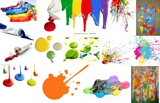
For this project I wanted to do something fun, bright, and colorful. From there, I started to think about paint and the fun you can have with all the colors and things you can do with the paint. I started to think about the paint splatters, drips, drops, and tubes, going along with the Jackson Pollock ear. It would be fun to experiment with this and the types of photographs that could come from it. However, I do realize I have to be careful with this idea since it can turn kid like and cheesy if not watched. Which is why I will stay away from illustrations and mainly focus on using photography.

Mood Board

The color palette I wanted to keep bright and bold. I pulled all the colors from my mood board images.

The color palette

Responsive Web Design

Being Responsible
With all the new technology and web able devices, this has created more responsibility for web designers. When creating a new site, the possibility that the site will most likely be viewed on a tablet and or smartphone as well as a computer has to be considered. Luckily, there are some designers already on the move creating and figuring out new tricks and trades to make one site functional on all sorts of internet able devices. I find it pretty amazing the ways this can be accomplished after do the required readings. Some ways did seem more difficult than other.

My Site Getting Responsible
The one thing I know I would do to make my cupcake website more device friendly would be to use the idea of fluid grids. I feel like this is one of the better ways to achieve this since it is more about the proportions according to the size of the screen/window. I would apply the percentages to the site logo, some images, and headings. I would combine this with using specific CSS styles according to the size of the screen. Within this, I would use the practice of minimum and max heights. I made an Photoshop comps for visual aids to how I would adjust elements depending on if it was on a computer, tablet, or smartphone.

The Home Page

The three size differences for the home page.

Going from a computer to a tablet would be more simple in a sense. I would use min-max heights with percentages and make the overall design smaller, such as a smaller column width for the content. When going to the smartphone is when things would have to start getting stacked, like navigation and the sidebar over the article.

Interior Page

The three size differences for an interior page.

For this page, going from a computer to a tablet would require more changes. I would have the 4 across of pictures shift into a 2 across. Min-max heights with percentages would be used for the logo and navigation. The length of the content would be shifted as well. Going to a smartphone the images would be fine and just loose some of the negative space around them. The navigation would have to be stacked and the content length would be shortened.

Post #8-Freebie

For this post I started out at the site, Binary Turf, looking through their list of 52 examples of websites with pastel pallets that I found during research for my final project. From this, I chose to do a website critique of one of the sites I found interesting. I will be critiquing Steven Hylands, a graphic designer, website.

Above the Fold

Color & Typography
The color is one of my favorite parts of this site. I enjoy the mix of hot pink, light teal, and black. They mix well together and great a nice harmony together, yet it has a nice contrast, especially with using black. It was used well throughout the entire site between the logo, navigation, subtitles, and so on. The typeface was kept simple with a san-serif throughout the site, which was smart to me since the color choice was bolder.

Navigation & Logo
The navigation was placed in the typical spot towards the upper, right hand corner. It was kept simple with a black, san-serif typeface, but the interesting part was the selected state. It was almost like brush stroke clump in pink over the selected page, which is simple but effective. I thought he got creative when creating the logo for himself playing with the letters in his name. I enjoy how he extended the end of the Y and L to create the bottom of the border of the logo.

The Navigation Bar

The Logo


Grid & Layout
The grid was kept standard with a 12 column grid, although it seems like some things did not quite follow the grid as well. I though it was interesting to break up the layout by having the top section being broken up with a squiggly, pink line. This made the logo and navigation it’s own section on the page making it easy to find on every page. Each of the interior pages were customized to fit it’s needs. Such as the the work page for example, is image based with a side navigation to get you through the different types of works. The navigation has some of the same features from the main navigation at the top with the same paint type spot over the selected tab.

The Grid

How the Page is Broken Up.

Example of the Work Interior Page

Post #7-Dissect a Website

The website I am dissecting is Bullet PR, a company in the UK specializing in public relations, and it is a one page site making it fairly easy to navigate and break down the HTML and CSS.

Above the Fold

Layout
The layout is kept fairly simple, partly due to it being a one page site, but they were able to break it up to make each section feel like it’s own page, yet one complete design. I was able to break down the layout into a 14 column grid, but the content was only in the middle 6 columns, leaving 2 extra on the sides. The whole site was put in one big division called the wrapper and within that are two main divisions, “new menu” and “content”. The content was broken down into 5 more divisions, “contentHome”, “contentAbout”,”contentServices”, “contentClients”, and “contentContact”, which were each sections of the site. The background was constructed as one image.

The main divs from the HTML


Grid Structure

Navigation
The navigation was done in a div called “newMenu” and done as an unordered list. Each list item had its own id as well, with an image replacement in the form of a sprite. Since it’s a one page site, instead of having the navigation bar repeat itself within each section, it stays stationary at the bottom off the page as you scroll down. It is also slightly transparent allowing some of the background to show through.

HTML for the navigation

The navigation's HTML fully opened up

The Navigation Bar

Type Choices
The type family chosen for this site was kept classic and used Georgia, New Times Roman, and Times. The headings for each section are word marks and used image replacement for them.

Content Sections
As mentioned before, each secetion of content is it’s own division. However, each of those divisions, About Us for example, are broken down even more into a header, content, footer, and clear. The only thing in the header is the image replacement for the heading. The content is broken down into two more divisions of a left and right, basically making the two columns of text that float next to one another. The only thing in the footer is a graphic line element on the outside of the content to make it seem boxed in. The clear division is obviously to clear the floats in the content division.

HTML for the About Us section

About Us HTML fully opened

About Me broken up according to the 3 main divisions


Post #6-Visual Inspiration

After creating a mood board for my final project, a website on creating cupcakes, the next logical step was to look at and get inspiration from already existing websites. I browsed through cupcake websites to see what was already out there within the same subject matter and other websites that fit the same color palette and feel I am searching for.

Magnolia Bakery

Above the Fold

Magnolia Bakery is a bakery based out of New Your City. I enjoyed their site quite a bit for a few different reasons. First the overall color palette and how it was treated. It was done in pastels but was not super feminine like you would expect and focused on the greens, blues, and creams, which was a nice change and maybe something for me to keep in mind. The navigation bar was done creatively with the chalkboard appearance, I just wished the links would have changed in the hover state. It was interesting to me to have the navigation expand once inside a certain page instead of creating a separate sub-navigation. They did some interesting treatments to the photo boarders and made the photos tilted instead of a typical straight, squared format. I also enjoyed what they did with the title of the page you were on by making it seem like it was on hanging sign.

Expanded Navigation Bar

Photo Treatments

Page Titles


Molly’s Cupcakes

Above the Fold

Molly’s Cupcakes is a bakery from Chicago, Illinois created in the honor of the owner’s 3rd grade teacher. What I enjoyed about this website was how they organized the content neatly and was able to compact it without seeming crowded. They also did some nice treatments to the photo boarders, and I enjoy the hand rendered quality to it. I also felt they did a good job of mixing the different display typefaces with the san-serif they used for the main content, which will be a good reference for me to refer back to when I start designing.

Example of a Body of Content

Example of a Photo


Soup Studios

Above the Fold

Soup Studios is a company that makes functional handmade pottery based in Athens, Georgia. Their color palette is a little darker than I plan to use but I feel they used their colors wisely and are pleasing, which is important. They incorporated some interesting graphic elements to give their site some pizazz. They use simple lines to to create decorative elements and to separate sections on the page, such as the navigation side bar and the main content. It was nice to see a site even pay attention to the footer and give it some design, where as some sites just put something there just because they should.

The Seperation of the Navigation and Content

The Footer

Previous Older Entries